Want Your Room to Look Professionally Designed? Start With the Palette, Not the Paint
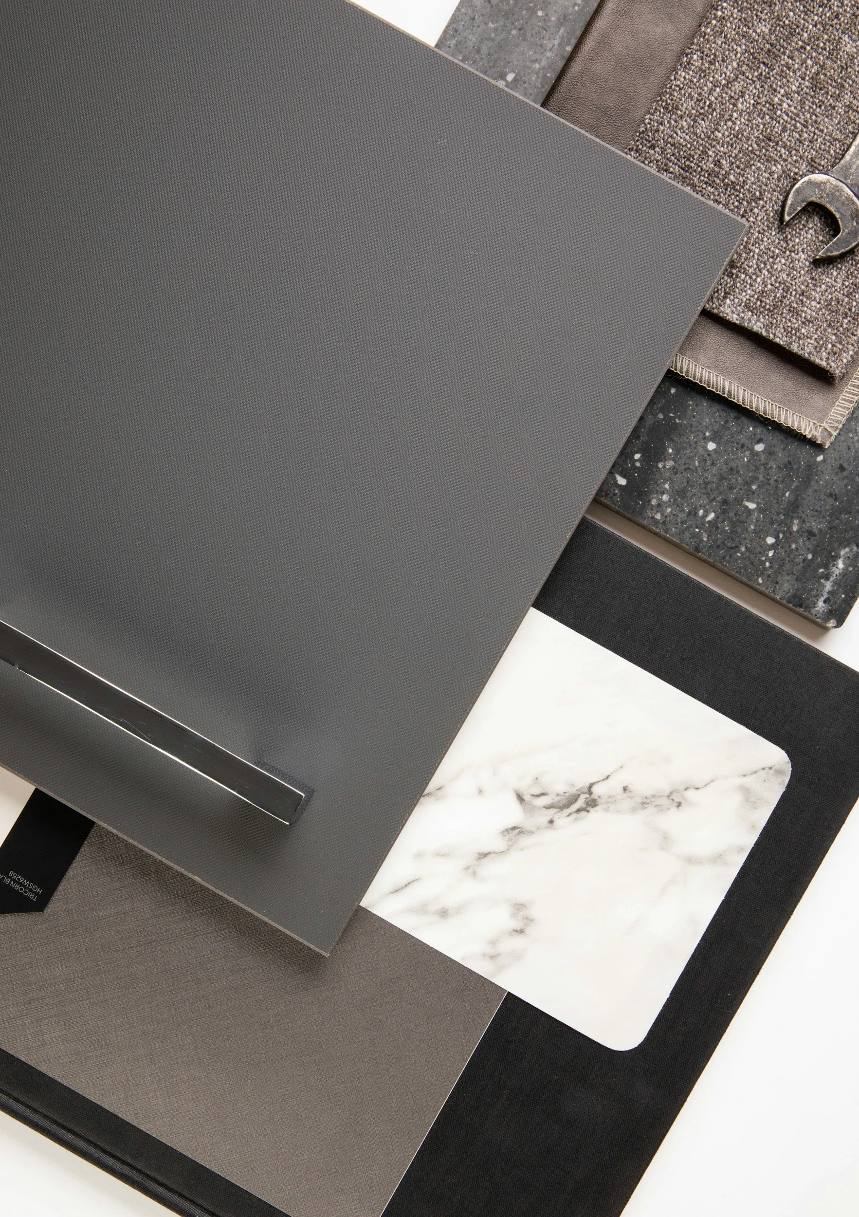
If you’re planning to repaint a room, one of the easiest mistakes is starting with this question:
“What color should I paint the walls?”
Instead, start with:
“What is the color palette for this room?”
At Brush & Pride Painting, we believe paint colors work best when they’re selected as part of the overall design—not independently from everything else in the space.
That includes your walls, ceiling, trim, flooring, furniture, fabrics, lighting, and architectural features.
And there’s absolutely nothing wrong with using white.
White walls, white ceilings, or white trim can all be beautiful choices. But white still affects how surrounding colors are perceived. A bright white placed beside another color can change how you perceive that color’s warmth, coolness, depth, and intensity.
So rather than automatically defaulting to white ceilings and trim, choose those colors as deliberately as you choose the walls.
If you want your room to feel more like it was put together by an interior designer, here are five suggestions to consider.
These aren’t rules. They’re simply good starting points.
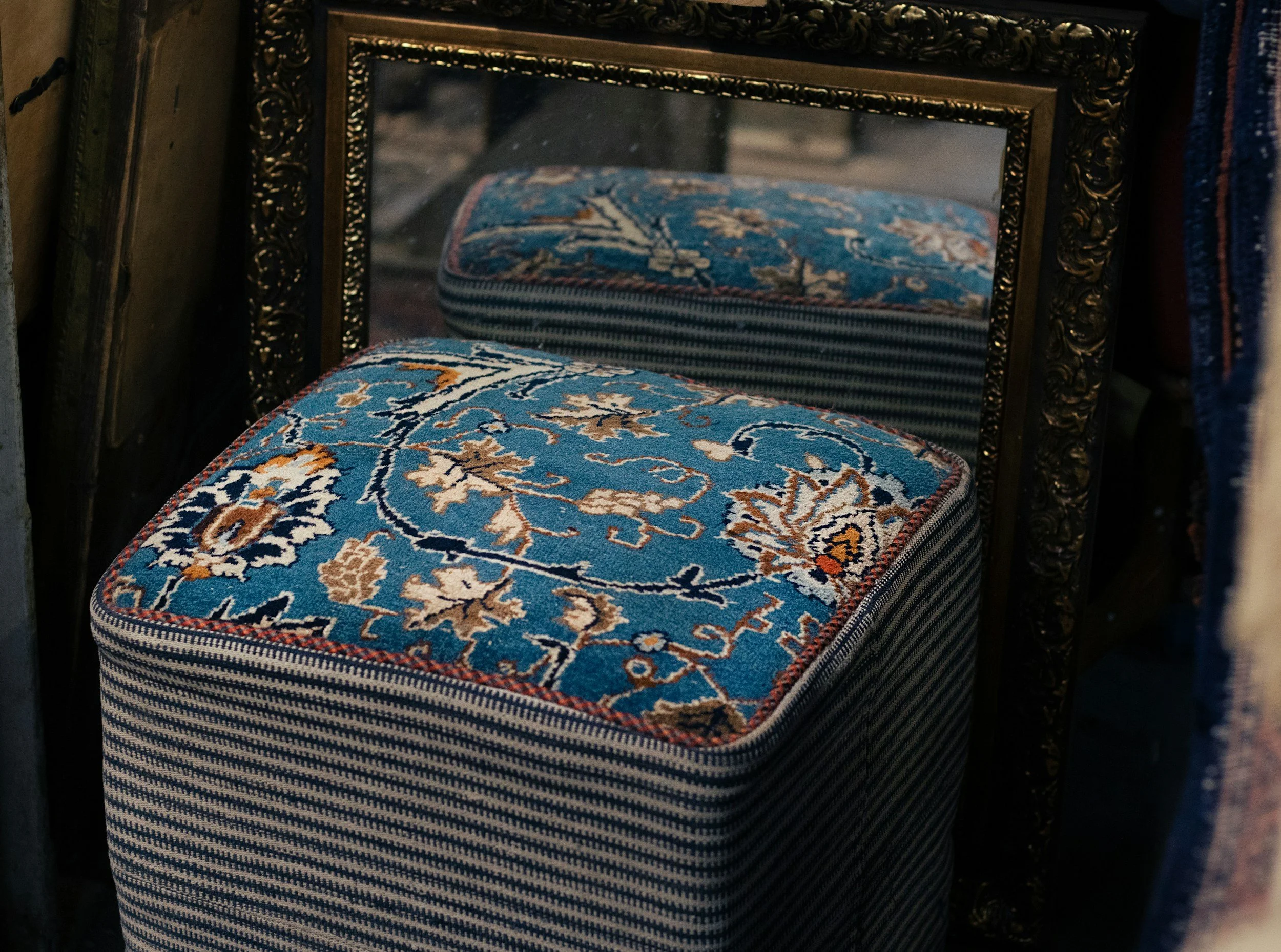
1. Start With an Inspiration Piece—Not a Paint Chip
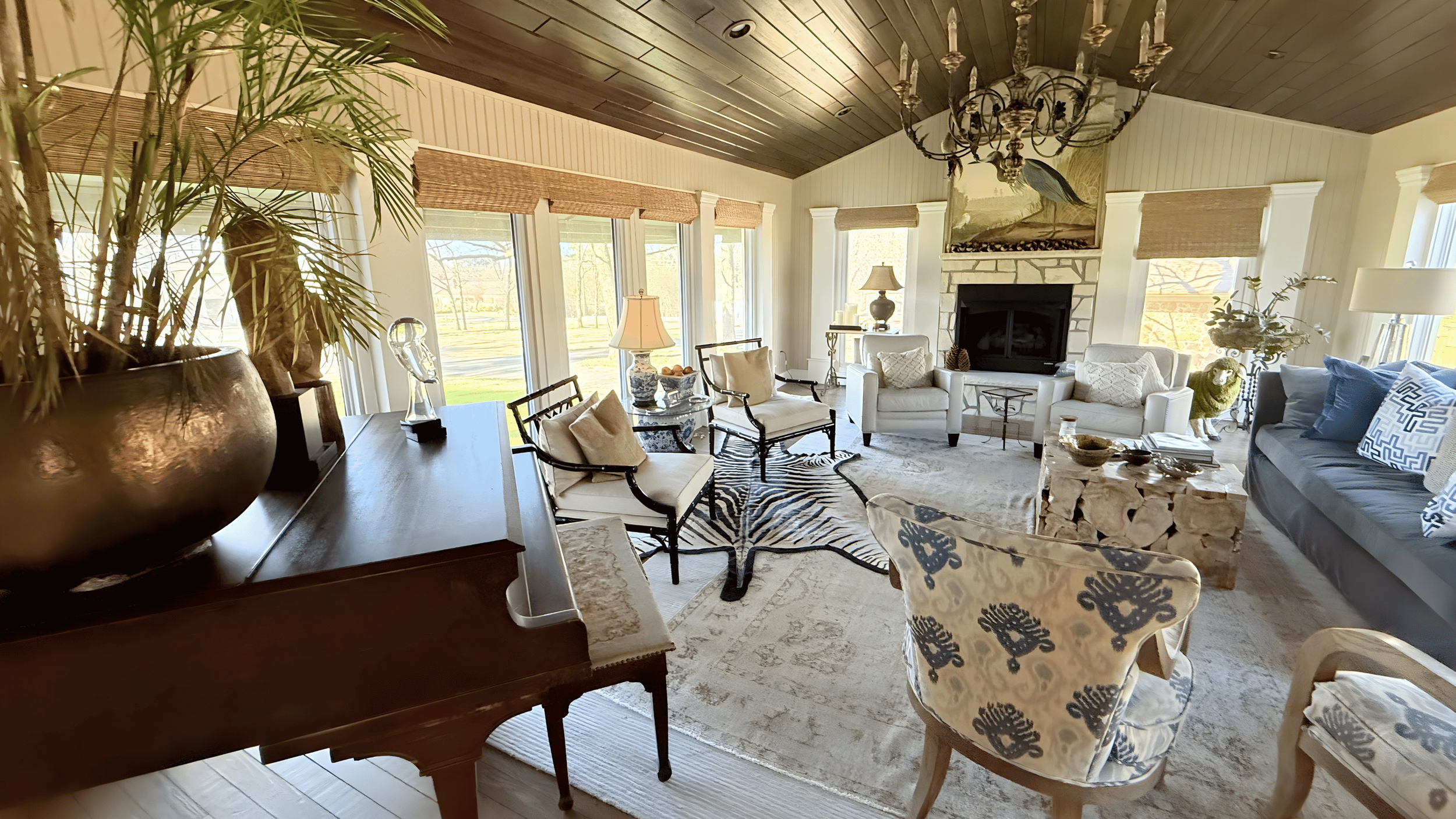
Before selecting paint colors, find something in the room that establishes the direction for the palette.
It might be:
An upholstery fabric
Drapery fabric
An area rug
Artwork
Bedding
A piece of furniture
A favorite textile
Another permanent or important feature in the room
Think of this as your inspiration piece.
A good inspiration piece already contains colors that work together. It gives you something tangible to build from rather than trying to create an entire room around an isolated paint swatch.
Look at the colors within that object.
There may be a dominant color, several secondary colors, and smaller accent colors.
Those colors become the starting point for your palette.
From there, you can decide which colors should appear on the walls, which might work for trim or ceilings, and which should remain accents in furnishings and accessories.
Choose the palette first. Then choose where those colors belong.

2. Don’t Automatically Default to White Trim
Once you’ve established the palette, look at the trim.
White may work beautifully.
But don’t choose it simply because trim is traditionally painted white.
Consider pulling a lighter or darker color from your inspiration piece or using a variation of the wall color.
You could also use the same color on the walls and trim and allow the difference in sheen to provide definition.
Why does this matter?
Because white doesn’t visually disappear.
A crisp white beside a warmer or muted wall color creates contrast, and that contrast can affect how the wall color is perceived.
Sometimes that’s exactly what the room needs.
Sometimes it isn’t.
Choose white because it belongs in the palette—not simply because the surface happens to be trim.
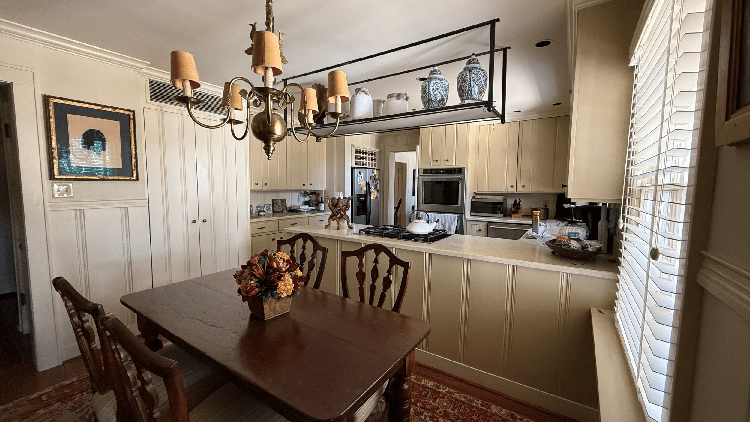
3. Treat the Ceiling as Part of the Palette
The ceiling is one of the largest surfaces in the room, but it’s often the last one considered.
It doesn’t automatically have to be white.
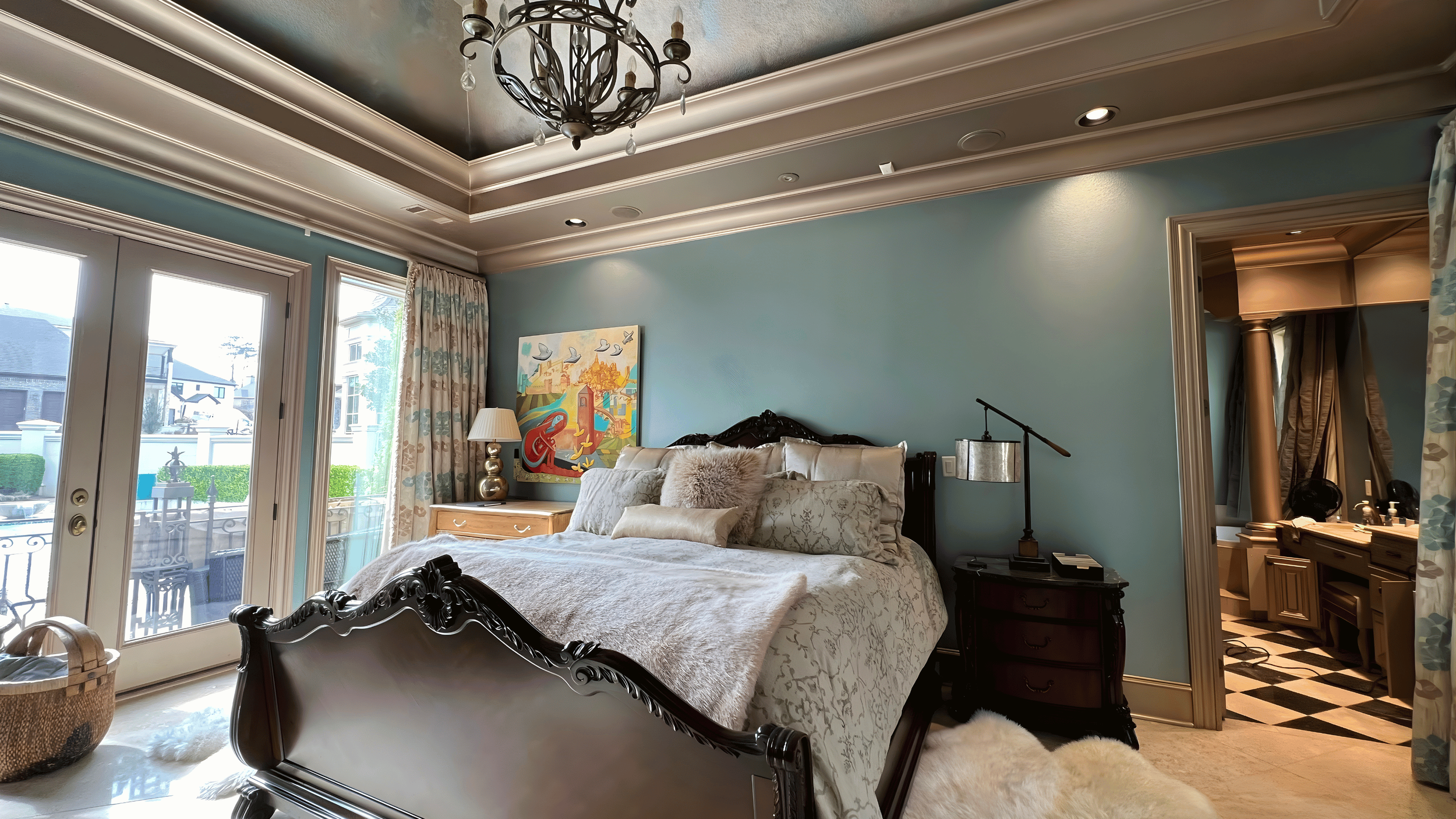
One option is to use a lighter strength of the wall color—perhaps approximately 25% or 50% strength—to create a softer relationship between the walls and ceiling.
Another option is pulling a complementary color from your inspiration piece.
You can also coordinate the ceiling with the trim.
For example:
Walls: Main palette color
Ceiling: 25%–50% strength of the wall color
Trim: Same color as the ceiling
Or:
Walls: Main color
Ceiling: Complementary palette color
Trim: Same color as the walls
There are many possibilities.
The important idea is that the ceiling shouldn’t automatically become white simply because it’s overhead.
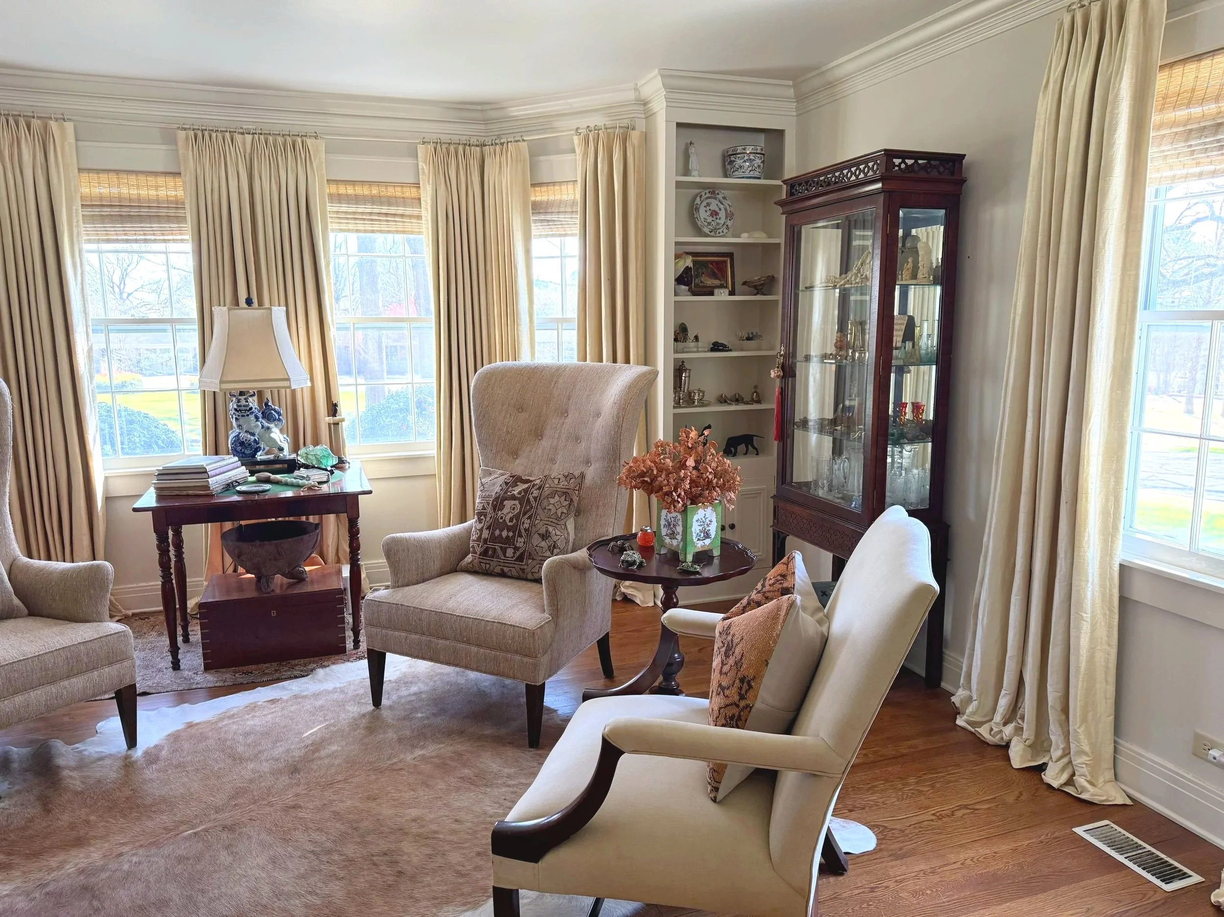
4. Let Sheen Do Some of the Work
You don’t always need another color to distinguish one surface from another.
Sheen can create subtle separation.
As a general starting point, Brush & Pride often prefers:
Walls — Eggshell
Ceilings — Flat
Trim and doors — Satin
Eggshell gives walls a subtle finish with practical washability.
Flat reduces reflection on ceilings and can help minimize minor imperfections.
Satin gives doors and trim definition and durability without the stronger shine associated with semi-gloss or gloss.
This can be particularly effective when using the same or closely related colors on multiple surfaces.
For example, eggshell walls and satin trim can be the same color but still read differently because of how each finish interacts with light.
5. Look at Everything Together Before Making the Final Decision
Before committing to the paint colors, step back and look at the entire room.
Your inspiration piece gave you the starting point.
Now look at how that palette interacts with:
Flooring
Existing woodwork
Cabinetry
Furniture
Countertops
Fabrics
Window treatments
Artwork
Natural light
Artificial lighting
Adjacent rooms
Then sample your proposed paint colors in the actual space.
A color doesn’t exist by itself.
The flooring underneath it, the fabric beside it, the light hitting it, and the trim surrounding it all affect how you perceive it.
That’s why selecting a beautiful paint color from a fan deck doesn’t necessarily create a beautiful room.
The color has to work with everything around it.
Why White Can Change the Way Your Colors Look
White is a color too.
And there are many different whites.
Some are warmer. Some are cooler. Some are muted. Others are extremely crisp and bright.
Put a bright, cool white beside a warm wall color and the contrast may emphasize undertones you didn’t notice before.
Use a softer white or a tonal variation instead, and the same wall color may feel completely different.
That’s why we don’t think homeowners should automatically use the same generic white on every ceiling and every piece of trim.
If white belongs in the palette, use it.
Just choose which white intentionally.
What If You Want an All-White Room?
That’s completely valid.
Your inspiration piece becomes even more important.
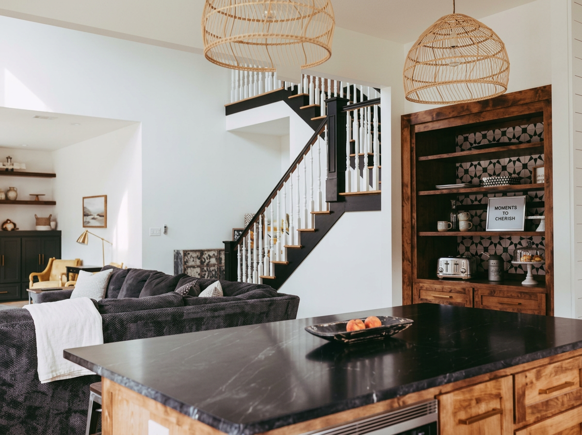
A predominantly white room may rely on upholstery, rugs, wood tones, artwork, texture, architecture, and lighting to provide depth and character.
The whites themselves can also vary subtly in warmth and tone.
An all-white room can feel sophisticated when those decisions are intentional.
The point isn’t to avoid white.
The point is to avoid choosing colors by default.
A Simple Starting Formula
If you’re designing a room and aren’t sure where to begin:
1. Choose an inspiration piece.
Find the rug, fabric, artwork, upholstery, or other element that sets the direction for the room.
2. Build your palette from it.
Identify the dominant, secondary, and accent colors.
3. Choose your wall color from that palette.
Don’t choose it independently.
4. Decide how the ceiling and trim relate to the walls.
Consider tonal variations, complementary colors, or intentionally selected whites.
5. Use sheen to create additional definition.
As a starting point: eggshell walls, flat ceilings, satin trim.
Then sample everything together in the actual room.
Our Advice Before You Choose a Paint Color
If you want your room to feel professionally designed, don’t begin at the paint counter.
Begin with the room.
Find the object that inspires the design.
Build a palette around it.
Then decide how your walls, ceiling, trim, doors, furniture, fabrics, and architectural features participate in that palette.
Sometimes the answer will include white.
Sometimes it won’t.
Sometimes the walls and trim will be different colors.
Sometimes they’ll be exactly the same color in different sheens.
These are suggestions—not rules.
But the underlying principle is one we think is worth remembering:
Don’t choose a wall color and then try to design a room around it. Choose the room’s palette first, and let the paint become part of the design.
Brush & Pride Painting Company
Professional Interior Painting • Cabinet Refinishing • Exterior Painting • Residential Restoration
Little Rock & Central Arkansas